
NN Saxenda Annual Meeting
visual design / display design
Weight loss is a journey, and Saxenda is more than just an injectable—it’s a companion along the way. With its sleek, pen-like design, Saxenda embodies both a tool for change and a path forward, reflected in its iconic “S” shape. The initial visual concept embraced hope, portraying Saxenda as a Northern Star, guiding patients through the challenges and triumphs of weight loss.

S-Curve

Product Pen

Guiding Light

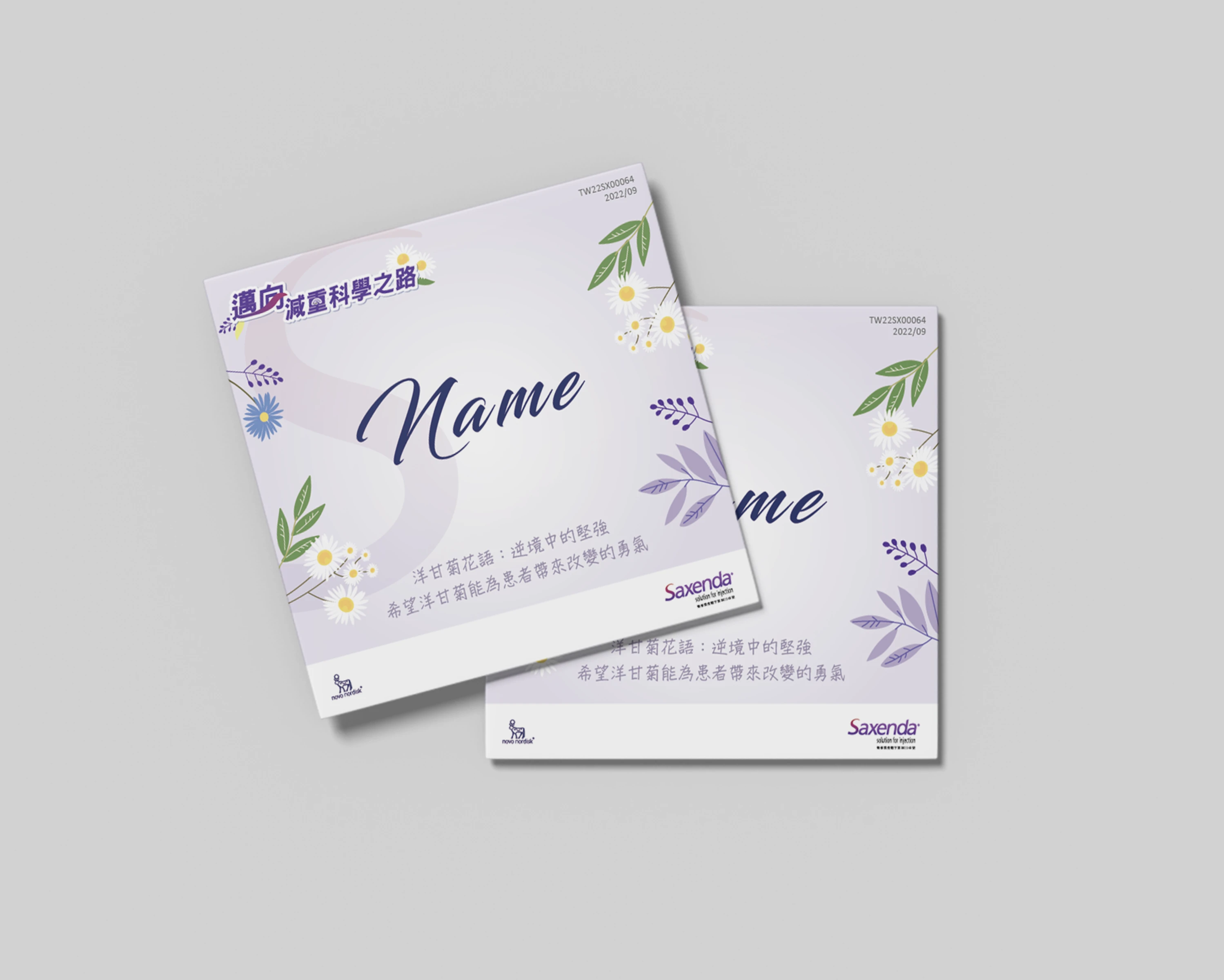
To meet pharmaceutical guidelines and the client’s request for a brighter, more uplifting approach, we reimagined the concept. This time, chamomile took center stage—symbolizing strength in adversity. Just like Saxenda users, chamomile thrives despite challenges, turning struggle into growth. Integrated into both the visual design and exhibition hall, chamomile elements added freshness and vitality, reinforcing Saxenda’s message: this journey isn’t just about weight loss—it’s about transformation.
S-Curve

Drawing

Chamomile


Live Photo


